
Historically, most web designers and their clients have first approached the desktop side of each project, while the mobile part has been left behind as a secondary goal that will be reached later. Even with the emergence of responsive design, many of us start with the “full-size” site and work our way down.
A disadvantage of this is that priority is given to desktop/laptop users. Unfortunately, many functionality and design elements that are optimized for laptops and desktop computers do not transfer well to the mobile version of the design.
The growing importance of mobile designs has contributed to the fact that many designers have followed a “Mobile-First” strategy in their designs.
In this article, we want to talk about why it is so important to do this.
What is a mobile-first design?
The first mobile design is a design strategy that says that when you create a website or an application, you must first start sketching and prototyping the smaller screen and moving to larger screens. Basically, it’s about offering the right user experience to the right device.
The reason why this makes sense is that with such a limited real estate on small screens, UX designers must prioritize the most important aspects of their website and their applications, namely the content.
For many years, mobile websites were a late idea of the design process. An addition is not a necessity. The slow decline in desktop computers along with the increase in mobile phones in the last 5 years has shown that the first mobile design must take priority.
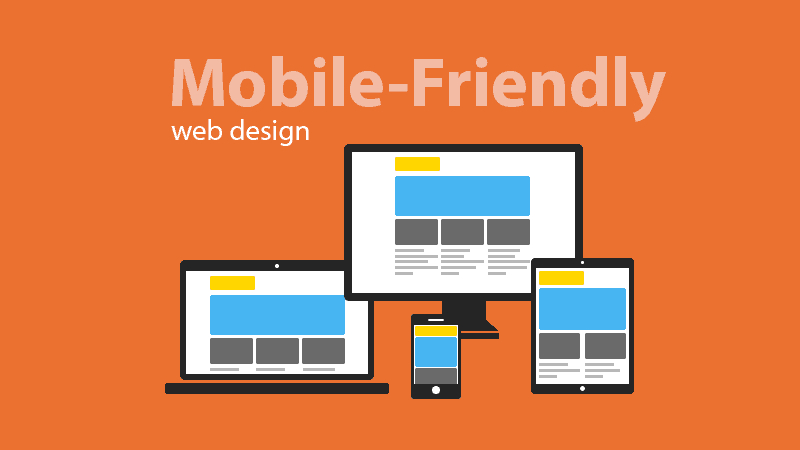
Mobile-Friendly vs Mobile-First Design
We have become accustomed to the terms responsive and mobile-friendly design. Isn’t it exactly the same as mobile-first web pages? Although the two terms sound somewhat similar, they have different meanings.
The responsive design builds on the concept of media issues that are directed to specific units and viewport sizes. With this in mind, you can encode your first CSS for a mobile perspective and then use media questions to selectively serve up additional styling as the viewport size increases.
This is probably the opposite of the method you usually use with responsive design: start big and then reduce. Given the arguments above, there is obviously a lot of logic behind structuring your media queries from small to large.
Mobile-first web design is an independent technical strategy for building websites. Instead of building a website for the screens on larger devices, the technology suggests that you put a smaller smartphone screen at the heart of your web development strategy. This allows you to focus mainly on the essentials, giving the primary focus on design elements and content that have the greatest impact on your brand and your audience.
Read also: Mobile-First Web Design vs Responsive Web Design
Why “Mobile First” Principle Is So Important
The mobile conversion rates have increased by 64% compared to the average desktop conversion rates. So designing mobile-first can be of greater benefit to your business.
And since Google is ranked for mobile-friendly, it makes sense to keep this in mind when starting a new project.
This way of designing is also beneficial when it comes to downloading times and users who access your content as quickly as possible. With fewer elements, the page loads faster. When you think of a 1-second delay that causes a 7% loss in conversions – it pays to design mobile-first.
With mobile-first, you create your strong foundation. This foundation will help strengthen other tablet and desktop designs. The basis should always be content and mobile-first design emphasizes content over navigation – users get the information they need faster.
This will also make your life easier as the mobile’s first design starts with managing the toughest screen size to design for. The rest inevitably falls into place.
Mobile-first design forces you to really focus and maintain clarity by removing unnecessary user interface decoration. By removing any distractions you will always improve the user experience and it gives good business vision.
How to create a mobile-first design
One of the best and fastest ways to build mobile-first pages is to use a responsive website creator that lets you build unique designs code-free. The popularity of drag-and-drop page builders is growing rapidly. There is no need to spend time on the learning curve to be able to create versatile web pages without adjusting the code.
In addition, you can use ready-made web themes that contain all the essentials needed for a quick start of your web project. All you have to do is choose a web theme that suits your topic, adjust it using the drag-and-drop admin panel, upload the pages with your content and bring it online.
Conclusion
Neglecting mobile design at this time is a UX design sin. Delivering a pleasant user experience should be at the heart of what we do. Using this first mobile strategy will not only make your life easier as a designer but it will also make the life of the user easier. And isn’t that why we do this?
Shared by Web designing training in Chandigarh. If you want to learn web designing course and make their career as a web designer, then CBitss is the best place to learn web designing training in Chandigarh.